Designing for the people who weren't in the room
RDK Central: Website UX
Role: UX Lead · Year: 2025
Team: Yve (UX), Lodewijk (UI Lead), 4 developers, 1 QA tester, 1 project manager, 2 stakeholders
Platforms: Desktop + mobile
In short: RDK's website was built by insiders, for insiders. The people who knew the most had worked there for ten years or more, and what was obvious to them was invisible to a new operator or partner. My job was to design for the people who weren't in the room.
Context
The board asked for a new website. But the existing site told a tech-first story, written from the inside out, while RDK is really driven by a community of operators, OEMs and partners.
So Lodewijk and I proposed a shift from tech-first to community-first: a site that starts from what visitors need, not from what the organisation knows.
The challenge: turn deep insider knowledge into a site that makes sense to newcomers, in limited time, and keeps making sense as content grows.
Phase 1: Getting insiders to explain the obvious
The site had to serve five audiences. Within the timeline, that wasn't realistic. So I focused on the two RDK works with most closely: technology partners and operators. The other three moved to a second release.
Then came the real challenge. Most of the experts I spoke with had worked at RDK for ten years or more. Their knowledge was deep, but so ingrained that it was hard to put into words. Some didn't understand why we were asking: to them, it was obvious.
That was exactly the problem. What's obvious to an insider is invisible to a newcomer.
So I used three routes to bring that knowledge to the surface:
Team sessions and brainstorms, so people could build on each other's input.
One-on-one conversations, to dig deeper where group sessions stalled.
A written questionnaire, so people could explain things in their own time.
What emerged was simpler than expected, and more important. RDK's mission is to provide a shared code base for hardware, so anyone can get started quickly and focus on building new innovations. To insiders, that was so obvious it barely needed saying. But for a new operator or partner, it's the very first thing they need to understand: why RDK, and what's in it for them.
So that became the starting point of the site: lead with the why, then guide each audience to their route.

Phase 2: Making the path visible
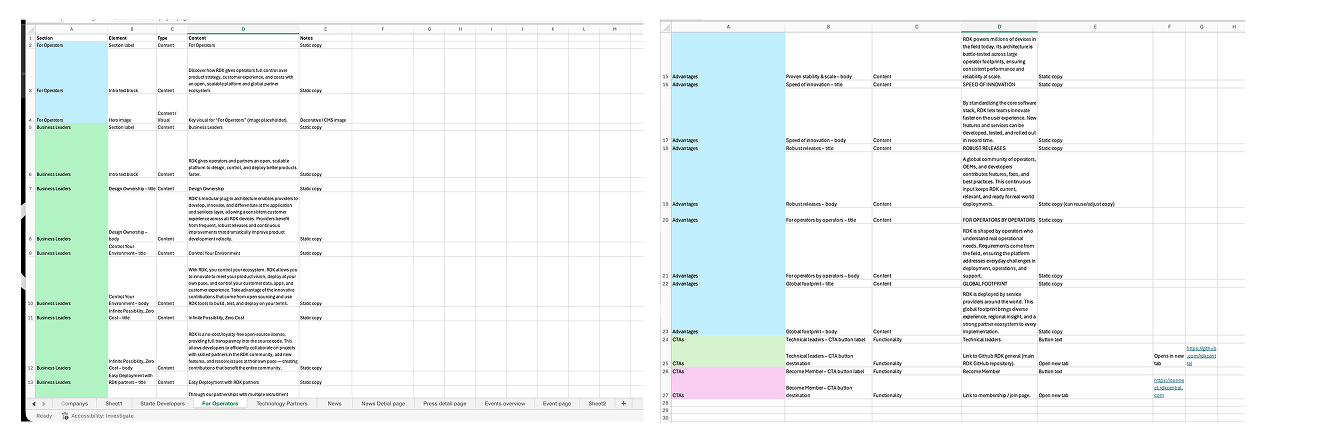
With that knowledge on paper, I defined the information architecture and key journeys for both audiences. I mapped every flow in a structured Excel flow map, which gave stakeholders one place to agree early, rather than during development.
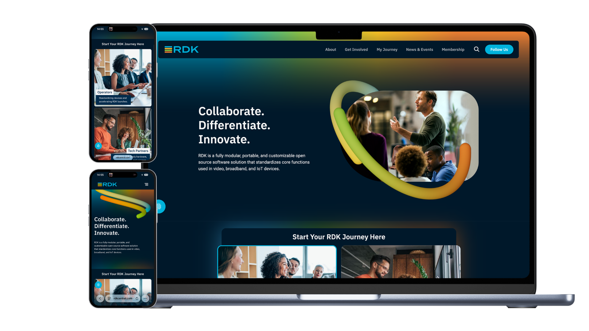
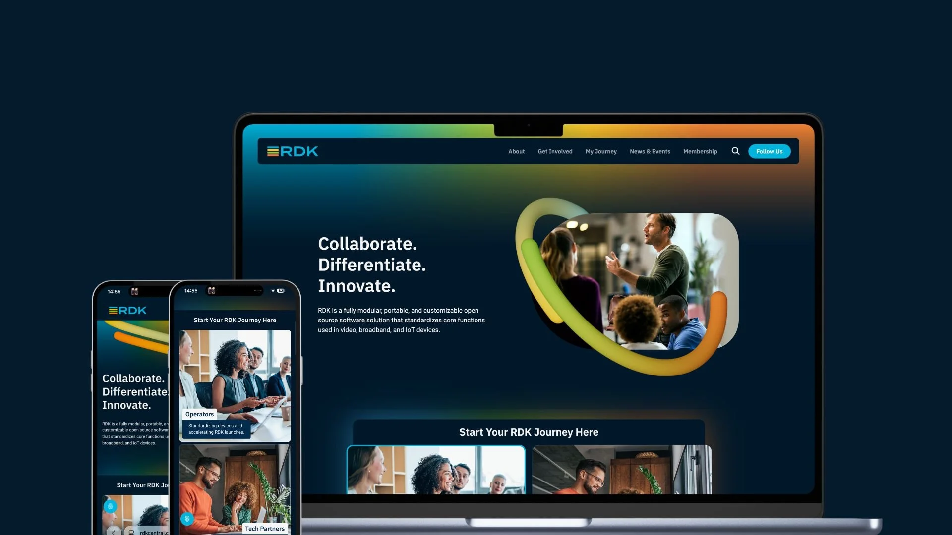
The result is on the homepage. Instead of expecting visitors to know where to look, operators and technology partners each get their own route, shown as a large card with a clear headline. In tests, colleagues found their route within a minute.
Phase 3: Keeping it clear as it grows
A clear site on launch day can still drift. Once multiple teams start publishing, each with their own inside knowledge, the newcomer's view gets lost again.
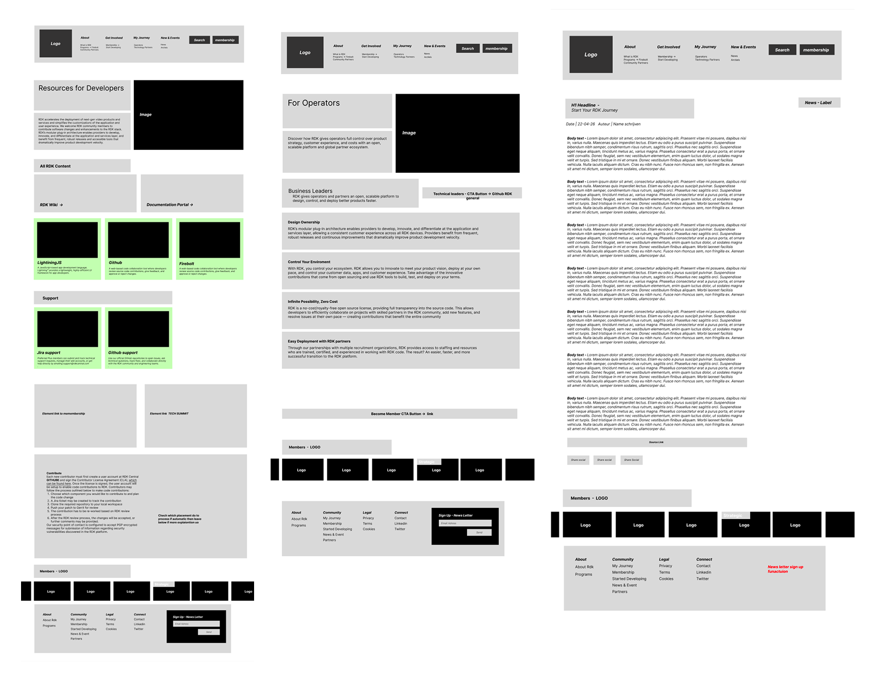
So I designed reusable components instead of individual pages, with CMS modules and content rules as guardrails. I set up the data collections and workflows myself, so engineering could build on them. This way, the site stays consistent on desktop and mobile, whoever adds the content.
Phase 4: Handoff and membership
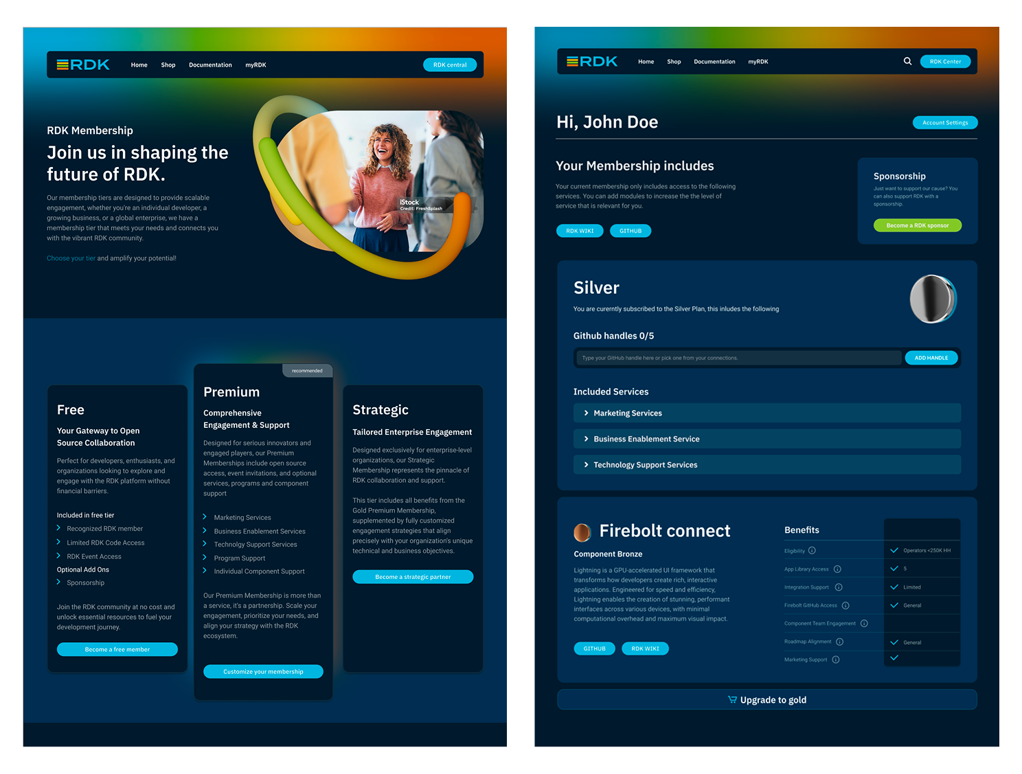
Once the UX foundation was in place, I handed it to Lodewijk for the visual design and moved to the membership area (e-commerce), reskinning it in the new brand style.
I had final go/no-go sign-off. During my final check before launch, the membership content still contained errors, and the responsive layout needed adjustments. So I delayed the launch by two days. For a new member, the first impression is the experience.
Managing scope
The three remaining audiences, and the pages built for them, moved to a second release. That kept the launch achievable without compromising the two core audiences, and because the site is built from reusable components, those pages can be added without rebuilding the foundation.
Result
A website that starts from the visitor, not the organisation. It leads with why RDK matters, then guides operators and technology partners straight to their route. The component system keeps it that way as content grows, and the foundation is ready for the next three audiences.
What I took away
The insight that shaped the project also shows its limit. We tested with colleagues, but they're insiders too. If I did it again, I'd build in time to test with an external group, real newcomers who'd show where the site still assumes too much. That's where I'd start the second release.