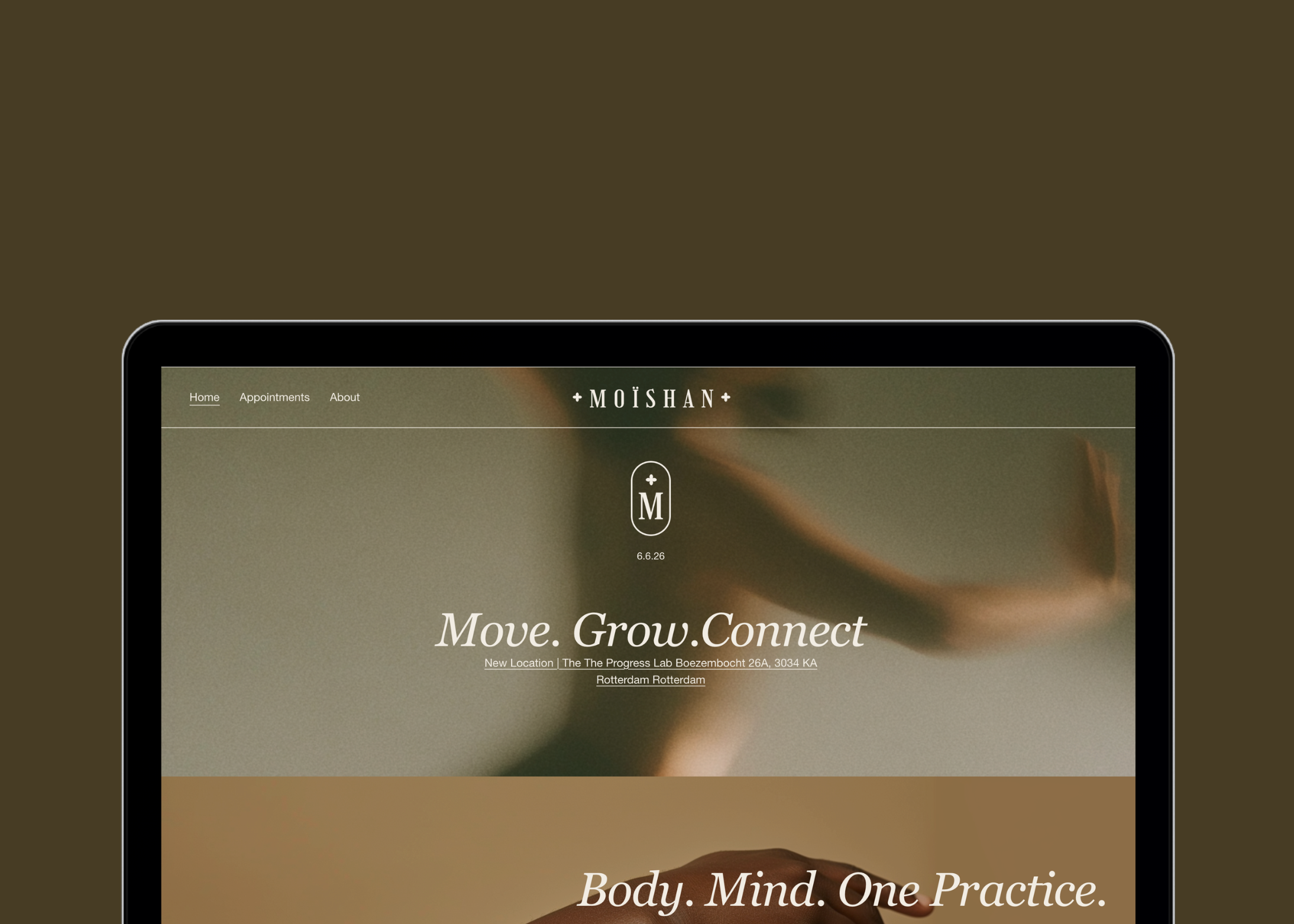
Move. Grow. Connect. I built the brand behind the words.
Rotterdam
2024
Role
Brand & Digital Designer
Client
Moïshan yogastudio Rotterdam
Tools
Figma, Webflow
One line
I was responsible for Moïshan's entire brand and digital infrastructure, from brand strategy to a working booking system.
Deliverables
Brand strategy & guidelines · naming · visual identity & design system · website (desktop + mobile) · dashboard · booking and payment flow · copy & class descriptions · email & Instagram · legal pages
Built Moïshan's entire brand and digital foundation on my own strategy, naming, visual identity, design system, website, member dashboard, and a working booking and payment flow. This case follows the two decisions that mattered most: how I found the brand's position, and why the first booking system had to be rebuilt
Finding a third position
Yoga and pilates studios tend to fall into two visual camps: cool Japanese-zen minimalism, or the bold hard-sport look. Neither fit Moïshan's audience design-conscious Rotterdammers who'd read the first as cold and the second as a gym. It had to feel like a brand you'd want to belong to.
So the brief became the gap between those camps: warm, grounded, premium, never loud. I shaped that into a positioning of slow luxury calm as a form of luxury.
The test of a positioning is whether it survives real choices. My first accent palette leaned warm-earthy terracotta and clay but it pulled the brand toward a trend everyone was using that season. Warm, but not quiet. So I dropped it for a palette built on stillness instead of heat: linen and sand, a grounded sage green, deep forest for text, and a single butter yellow used sparingly. Green over orange locked the positioning in place. An editorial serif paired with a clean sans did the rest considered on a poster, legible in a booking screen.
The booking system, why the first solution didn't hold
My personas made one requirement non-negotiable across all three: booking and paying in a single motion. I defined that up front —which is exactly why I could see the first system fail.
Phase 1 Acuity.
The logical choice: it integrated seamlessly with Squarespace and handled scheduling well. On paper, it worked.
What surfaced.
Acuity couldn't process iDEAL and in the Netherlands, iDEAL isn't optional, it's the default. Visitors who wanted to pay had to email for a payment link, an extra step at the exact moment you want them to check out. Worse, payment wasn't enforced at booking, so people reserved spots and paid later.
The decision.
The point wasn't that Acuity is bad, but that it didn't fit the market and the users I was designing for. The payment need was the first thing my personas made explicit, and the thing left unmet so I bent the system to the user, not the other way around.
I moved to SportBit Manager, a Dutch platform with iDEAL, SEPA and card built in via MultiSafePay, plus native passes, subscriptions and waitlists. Every persona need that phase 1 dropped was finally covered.
The trade-off.
SportBit is built for gyms and crossfit the exact world Moïshan was positioned against. I gave up some brand control in the booking step for a payment flow that works, and handled it by keeping that step contained, so the brand carries the experience right up to payment and hands over only where it has to. A visitor who can't check out doesn't book.
What I took from it
Building brand and infrastructure alone taught me where the two meet and pull against each other. A positioning is easy to write and hard to protect once real constraints enter the room. And a system choice only proves itself the moment someone tries to pay. Doing the persona work up front gave me a standard to hold every decision against, so when the first system fell short I knew exactly what was wrong, and why.
-
![An image of the Float House.]()
01