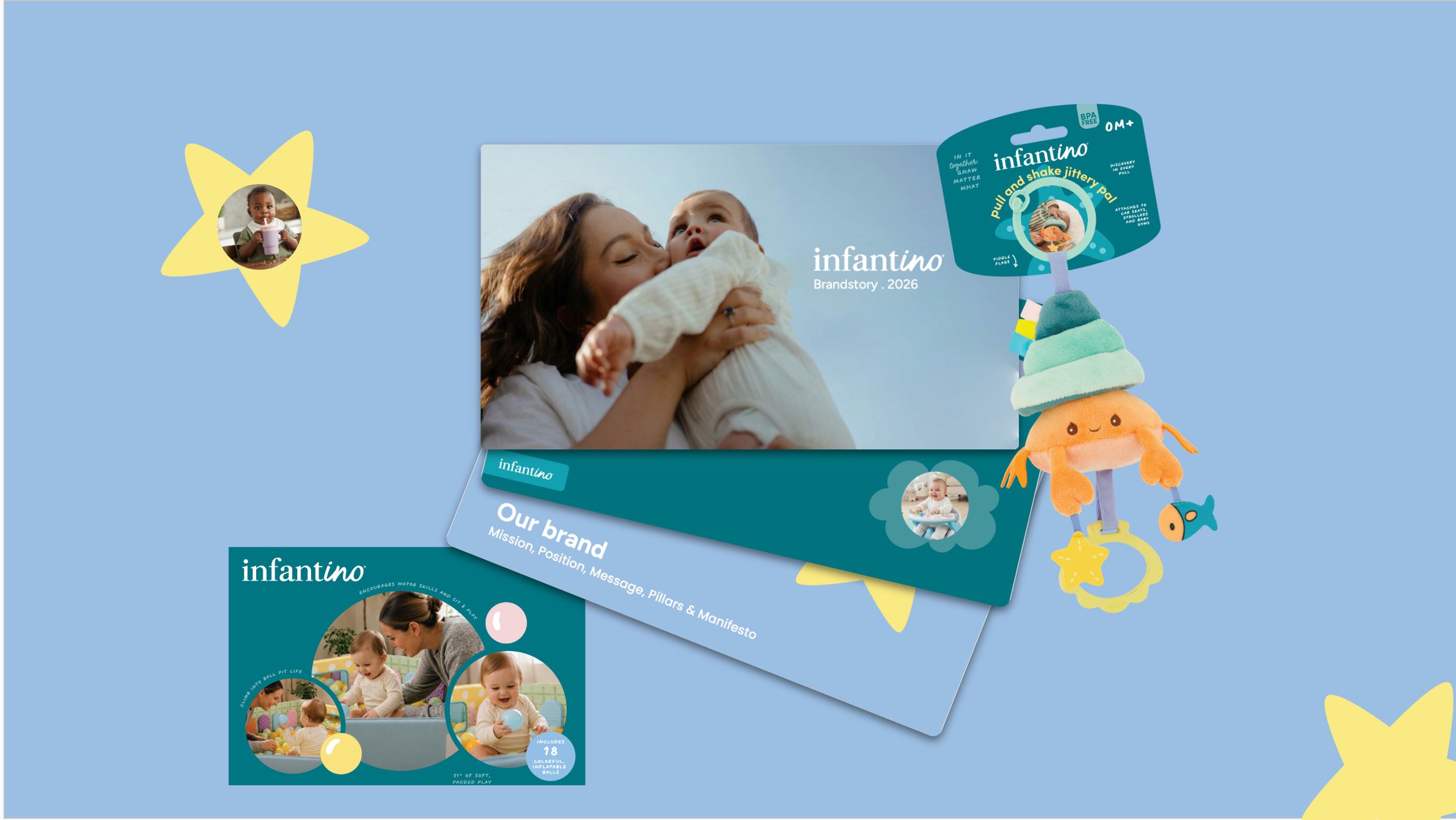
In it together, down to the last slide.
Brand guidelines, packaging and a sales template for a baby brand with nearly 50 years of history
Role: Designer, supporting the lead Creative Director · Year: 2026
Client: Infantino (via Nomand), Los Angeles
Scope: Concepts & pitch decks · brand style guide · category proposals for carriers and toys · packaging execution · PowerPoint template
In short: Infantino, an American baby products brand, was being modernized by Nomand. The lead Art Director set the direction. I supported the process: helping explore and research directions, building the style guide, making proposals within the Art Director's direction, and executing packaging and templates.
Context
Infantino had been making baby products for nearly 50 years, but the brand didn't show it. It didn't speak to a new generation of parents, and in a category where most brands look the same, it didn't stand out.
Nomand was brought in to modernize the brand and extend it across new touchpoints. The lead Art Director defined the direction and the rules, in close consultation with the client.
The challenge: make a heritage brand feel relevant to today's parents, and make the new identity easy to apply correctly across a wide product range.
Phase 1: Concepts and pitch
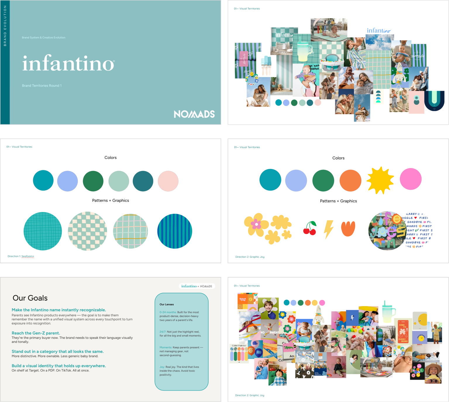
I helped explore and research the first brand territories and built the pitch decks to present them, from a calm, coastal direction to a louder, more playful one. This is where the brand story took shape: "in it together", a brand that's not just an expert, but right there with parents.
Phase 2: Building the style guide
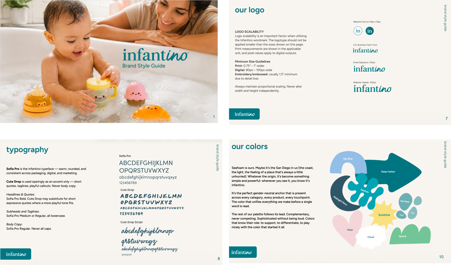
Once the direction was agreed, I built the brand style guide, based on the rules the Art Director had set with the client. My job was to bring it all together in a way that's clear, visual and easy to follow:
Logo: the serif and script wordmark, clearspace and minimum sizes
Typography: Sofia Pro, with Cute Drop as a playful accent
Colour: a palette anchored by Seafoam, with named supporting colours
Photography: real families in natural light, with on-brand and off-brand examples
Illustration and badges: a library of rounded shapes and a badge system
Phase 3: Carriers and toys
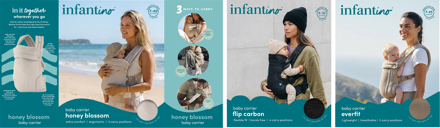
Infantino sells everything from toys to baby carriers, and they don't talk to the same person. Within the Art Director's direction, I made proposals for how the brand could work in two of the main categories:
Carriers: a considered purchase, so a restrained use of illustration and photography that leads with the product.
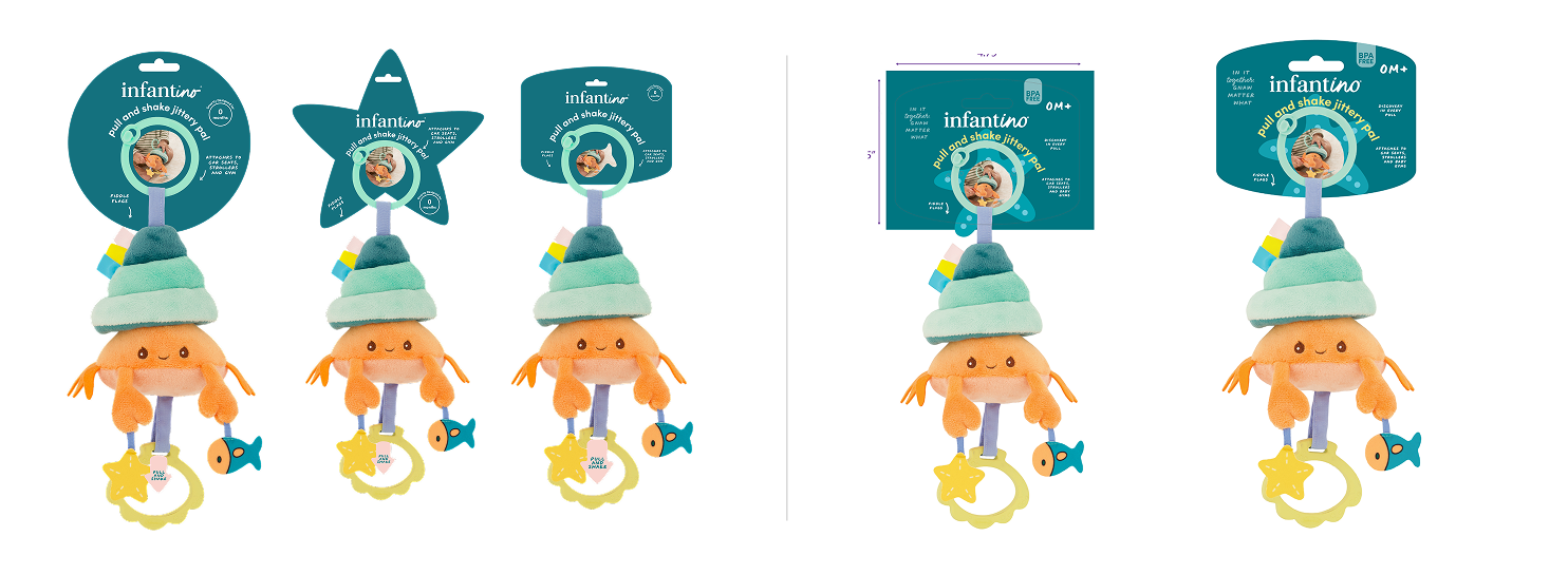
Toys: where the brand gets to play, with illustrations tied to the toy's theme, like the ocean theme on the pull and shake jittery pal.
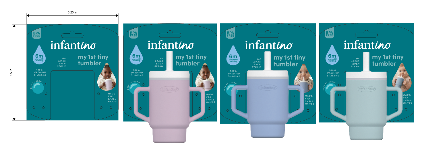
I then executed packaging based on that direction. For the my 1st tiny tumbler, I set up the pack from the dieline: a hang card built around the product's shape, with the stage, lifestyle photo, badge and feature callouts in place. The Art Director then finalised the design.
Phase 4: A template for the sales team
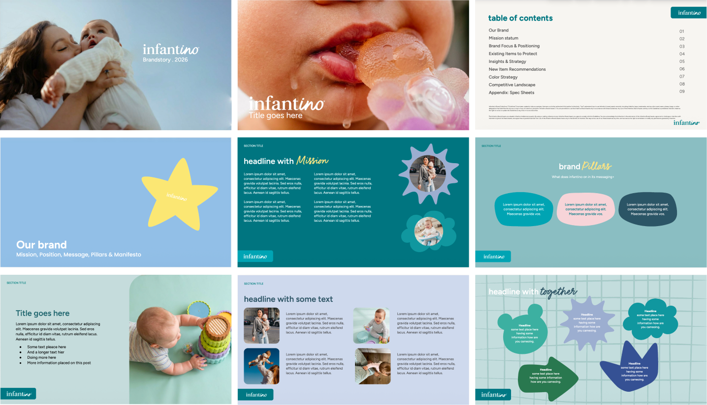
I also created a PowerPoint template for the client's sales deck, so their team could build on-brand presentations themselves, without needing a designer for every slide.
Result
The new brand is in use, on packaging and across Infantino's social channels. The client was very happy with how everything came together across the project, and the sales deck template stood out in particular: modern and clean, a clear fit with the new branding, and something their own team could use straight away.
The collaboration led to more campaigns for Infantino.
What I took away
Working in a supporting role taught me that a brand isn't finished when the direction is set. It only works once the people using it every day understand the rules. Translating someone else's vision into guidelines, proposals and finished packaging, without losing what makes it strong, is its own kind of design work.